London map poster — free & printable
London has no plan. It grew by swallowing villages, so the map is a web of high streets radiating from old centres that were separate towns two hundred years ago. The Thames is the only organising line, and it does not run straight — it meanders in deep loops, most dramatically around the Isle of Dogs, where the river almost doubles back on itself.
United Kingdom · centred near 51.5074° N, 0.1278° W
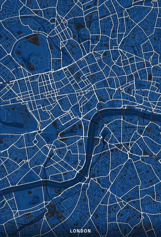
The river loop is the best crop in the city
Most cities give you a river as a diagonal. London gives you a hairpin. Framing east of the centre puts the Isle of Dogs meander in the middle of the poster, and the shape is distinctive enough that anyone who knows the city recognises it instantly without reading a single label. Greenwich sits on the outside of the bend, which adds the park as a green counterweight.
Absorbed villages make the street pattern
Camden, Hampstead, Greenwich, Richmond and a dozen others were independent settlements, and each still has its own knot of streets converging on a high street. On the map this reads as a series of small dense clusters joined by longer arterial roads, rather than the continuous fabric of a planned city. It is why a wide London crop looks busier at the edges than most capitals.
The parks carry the composition
Hyde Park, Kensington Gardens, Green Park, St James's and Regent's Park form a near-continuous chain across the west of the centre, and Hampstead Heath, Victoria Park and Richmond Park anchor the outer frame. In a palette with a distinct park colour these become the largest blocks of flat tone on the poster, so where you place them matters more than where you place any individual street.
Where to centre a London poster
- Shoreditch
- Tight irregular blocks where the City meets the East End, with the railway viaducts cutting through.
- Camden
- The Regent's Canal and the rail approaches into Euston and St Pancras converge here into a dense band.
- Greenwich
- The park, the Observatory and the outside of the river's biggest bend in one frame.
- Notting Hill
- Long crescents and garden squares that curve in a way the rest of west London does not.
- South Bank
- A narrow strip that puts the river across the full width of the poster.
- Hampstead
- The Heath's irregular edge against the street grid below it, and the highest ground in the frame.
Why Cyanotype suits London
Cyanotype reads as a blueprint, and London — a city with no plan — takes on a slightly ironic elegance in it. More practically, the blue ground gives the Thames somewhere to hide: in high-contrast palettes the river dominates everything, whereas here it sits at a similar value to the ground and the street web stays the subject. Ink and Midnight are the closest alternatives.
Printing and framing London
London sprawls, so decide early whether you are making a poster of the centre or of the whole city. Zone 1 fits comfortably on portrait A3. Anything wider — out to the North Circular, say — wants landscape 24 × 36", because London is much wider east to west than it is tall, and a portrait crop at that scale throws away most of the interesting river.
Every export is drawn at your chosen paper size rather than upscaled from a screenshot. See the full printing guide for sizes, DPI, bleed and crop marks.
London map poster questions
Should I include the whole Thames or just the central stretch?
The central stretch from Chelsea to Tower Bridge fits a portrait frame cleanly. Including the Isle of Dogs loop needs a landscape or square crop, because the river swings far enough south that a portrait frame crops the bend in half — which loses the one shape that makes the poster unmistakably London.
Can I make a poster of a single London borough?
Yes. Search the borough or a landmark inside it and zoom to around 14. At that level individual residential streets and their names render clearly, which works well for a print of the neighbourhood someone actually lives in.
Why do the railway lines show so prominently on a London map?
London has more surface rail than almost any comparable city, and the approaches into the terminals cut wide corridors through the built fabric. Most palettes draw railways as a distinct line weight. If they compete too much with the roads, switching to a lower-contrast palette such as Porcelain quietens them.